• Skip to primary navigation
  • Skip to main content
  • Skip to primary sidebar

John August

  • Arlo Finch
  • Scriptnotes
  • Library
  • Store
  • About

Apps

Punching the Hawk

December 20, 2012 Apps, Karateka, Projects

Karateka IconKarateka, our remake of Jordan Mechner’s groundbreaking game, is finally (finally!) available for iOS. So fire up your iPhone or iPad and tap over to the [App Store](https://itunes.apple.com/app/id560927460).

I really think you’ll love it, even if you’re not someone who usually plays fighting games. It’s beautiful. It’s simple. It’s like playing a Japanese fairy tale.

One of the best things about Karateka is that you don’t need to carve out a weekend to play it. You can pick it up and flatten some bad guys between finals. You can punch the hawk in the bathroom while hiding from your family. ((That sounds dirty. That’s intentional.))

If you have half an hour, you can make it to the final boss — but you’re unlikely to finish the story, because to get there with the True Love is going to require some practice.

But it’s the holidays. You can find the time.

Karateka is also available on Xbox, PS3 and Steam. Parents love all their children, so of course I love these platforms, too. But the iOS version is where I’ve spent by far the most time, both at work and play. I live my life on Apple products. The iPhone and iPad are my home turf, and I wanted their version of Karateka to be great.

We’ve actually had development builds of the iOS version since the summer. My seven-year-old daughter has probably played it 100 times. She’s better than me, except when it comes to the hawk. When she knows it’s coming, she’ll pause the game, find me, then have me deal with it. (Same with real-life spiders.)

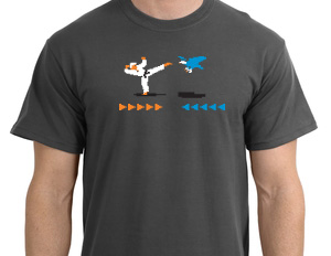
Jordan and the team at Liquid did the hard work of porting the console game to iOS — getting those polygons to behave is a beast — but we did quite a bit in our offices too. Ryan Nelson designed the icon, the menus, and these awesome shirts we’re giving away this afternoon:

t-shirt

People often ask me why I don’t sell any advertising for the site or the podcast. After all, both have a big audience, and hosting them costs money. But it’s just always felt weird to me stumping for something I don’t necessarily believe it.

I believe in Karateka. I love it and I own a chunk of it, both emotionally and financially. So if you’re a loyal reader and/or listener, a $2.99 download in the App Store would mean a lot to me.

(And if you love the game, a glowing review is also a big help.)

When you’ve had a chance to play the game, [tweet me](http://twitter.com/johnaugust) and [Jordan Mechner](https://twitter.com/jmechner) to let us know what you think.

We’ll also be looking for tweets hash-tagged [#punchthehawk](https://twitter.com/search?q=%23punchthehawk), so a witty one might find itself retweeted a lot.

The air duct of backstory

Episode - 67

Go to Archive

December 11, 2012 Fountain, Scriptnotes, Software, Three Page Challenge, Transcribed

John and Craig talk about perspective — both within a scene and the overall story. It’s not always obvious to the reader which characters are in the driver’s seat, so it falls on the screenwriter to make that clear.

We have four new Three Page Challenges this week, with genres ranging from horror to sex comedy. John begs you to never try to establish a character’s backstory by featuring them on a magazine cover.

All this, plus an update on John’s experience writing his most recent script entirely in Fountain, in episode 67 of Scriptnotes.

LINKS:

* [Hanukkah](http://en.wikipedia.org/wiki/Hanukkah) on Wikipedia
* [Christmas](http://en.wikipedia.org/wiki/Christmas) on Wikipedia
* [Krishna](http://en.wikipedia.org/wiki/Krishna) on Wikipedia
* [Fountain](http://fountain.io/) is a plain text markup language for screenwriting
* [Take Fountain](https://app.glassboard.com/web/invitation/code/gsaiw) on Glassboard
* Three pages by [Hunter M. Altman](http://johnaugust.com/Assets/HunterMAltman.pdf)
* Three pages by [Kevin Wolfe & Adam DeKraker](http://johnaugust.com/Assets/KevinWolfeAdamDeKraker.pdf)
* Three pages by [Scott Gorsuch](http://johnaugust.com/Assets/ScottGorsuch.pdf)
* Three pages by [Shawn Morrison](http://johnaugust.com/Assets/ShawnMorrison.pdf)
* [Scanadu](http://www.scanadu.com/)
* [Gizmodo](http://gizmodo.com/5965143/holy-spock-the-star-trek-medical-tricorder-is-real-and-its-only-150) on Scanadu
* [Soulver](http://www.acqualia.com/soulver/) helps you solve on iOS and OSX
* INTRO: [Crystal Light commercial](http://www.youtube.com/watch?v=CWr9rZVvMN0)
* OUTRO: [Three Is a Magic Number](https://itunes.apple.com/us/tv-season/schoolhouse-rock-vol.-1/id123015257) by Bob Dorough on iTunes

You can download the episode here: [AAC](http://traffic.libsyn.com/scriptnotes/scriptnotes_ep_67.m4a).

**UPDATE** 12-14-12: The transcript of this episode can be found [here](http://johnaugust.com/2012/scriptnotes-ep-67-the-air-duct-of-backstory-transcript).

Final Draft Reader’s limited view

October 22, 2012 Apps, FDX Reader, Highland, Screenwriting Software

Late last week, Final Draft released a new version of [Final Draft Reader](https://itunes.apple.com/us/app/final-draft-reader/id497421221?mt=8), adding support for iPhones to their heretofore iPad-only app.

From a basic design standpoint, their iPhone implementation is almost identical to what we did with [FDX Reader](https://itunes.apple.com/us/app/fdx-reader/id437362569?mt=8), using a continuous scroll rather than page-flipping to accommodate the smaller screen. I won’t break out the old imitation-is-flattery bromide; it’s simply the right choice given the situation.

Unfortunately, you’re going to be scrolling a lot with Final Draft’s version, because they insist on using traditional Courier. It’s a mistake. You simply can’t fit very much on the screen using that font.

Compare [two screenshots](http://johnaugust.com/Assets/fd-v-fdx-72.jpg) from Frankenweenie:

iphone screenshots

Like FDX Reader, Final Draft Reader allows you to reduce the font size. By doing so, you can fit the same amount of Frankenweenie on the screen. But you probably wouldn’t like the [results](http://johnaugust.com/Assets/smaller-fd.jpg):

smaller final draft screenshot

Final Draft Reader isn’t trying to match printed pages like it does in portrait view on the iPad, so there’s simply no good argument for sticking with Courier for this “Reader View.” It’s just bad design.

Being an official product, the app provides “100% accurate Final Draft pagination, formatting and page breaking.” That’s like saying only Coca-Cola can provide pure Coke flavor, but fine.

Their app can do several things FDX Reader doesn’t even attempt, such as editing ScriptNotes and showing colored page revisions. You can link to your Dropbox account, but only for exporting files *from* the app, so it’s not particularly useful. That’s consistent with a lot of what I found: placeholders and possibilities rather than actual utility.

Final Draft Reader is now free. That makes sense; they want users to pay for the $50 Final Draft Writer app.

We’ll keep selling and supporting FDX Reader as an alternative, but as I wrote [back in February](http://johnaugust.com/2012/pricing-fdx-reader), we’re not actively developing it anymore. Our next projects include more ambitious efforts like [Highland](http://quoteunquoteapps.com/highland/).

Fountain for Sublime Text

September 10, 2012 Fountain

Jonathan Poritsky has whipped up a [Fountain syntax highlighter](http://www.candlerblog.com/2012/09/10/fountain-for-sublime-text/) for [Sublime Text](http://www.sublimetext.com/), an increasingly popular text editor.

I love to see this kind of itch-scratching. It’s why we made Fountain. We want people to be able use it with whatever tools they prefer, and to whatever extent they find helpful.

Here’s a screenshot:

sublime fountain screenshot

Personally, I don’t find this kind of syntax highlighting all that useful for Fountain.

We designed the markup so elements would be defined by whitespace — both visually and logically. Character names already feel unambiguous to me, so making them a different color doesn’t do much. Putting notes and other meta info in color, on the other hand, seems potentially great. So maybe that will come in a future incarnation.

Regardless, there’s no right or wrong way to use Fountain. I love to see people making it their own.

**UPDATE:** Jonathan has already put out an update that adds in syntax coloring for Notes, Boneyard and other helpful meta-things. Totally worth a look.

« Previous Page
Next Page »

Primary Sidebar

Newsletter

Inneresting Logo A Quote-Unquote Newsletter about Writing
Read Now

Explore

Projects

  • Aladdin (1)
  • Arlo Finch (27)
  • Big Fish (88)
  • Birdigo (2)
  • Charlie (39)
  • Charlie's Angels (16)
  • Chosen (2)
  • Corpse Bride (9)
  • Dead Projects (18)
  • Frankenweenie (10)
  • Go (30)
  • Karateka (4)
  • Monsterpocalypse (3)
  • One Hit Kill (6)
  • Ops (6)
  • Preacher (2)
  • Prince of Persia (13)
  • Shazam (6)
  • Snake People (6)
  • Tarzan (5)
  • The Nines (118)
  • The Remnants (12)
  • The Variant (22)

Apps

  • Bronson (14)
  • FDX Reader (11)
  • Fountain (32)
  • Highland (73)
  • Less IMDb (4)
  • Weekend Read (64)

Recommended Reading

  • First Person (88)
  • Geek Alert (151)
  • WGA (162)
  • Workspace (19)

Screenwriting Q&A

  • Adaptation (66)
  • Directors (90)
  • Education (49)
  • Film Industry (492)
  • Formatting (130)
  • Genres (90)
  • Glossary (6)
  • Pitches (29)
  • Producers (59)
  • Psych 101 (119)
  • Rights and Copyright (96)
  • So-Called Experts (47)
  • Story and Plot (170)
  • Television (165)
  • Treatments (21)
  • Words on the page (238)
  • Writing Process (178)

More screenwriting Q&A at screenwriting.io

© 2025 John August — All Rights Reserved.