Editorial is one of the slickest text editors for the iPad, and thanks to some clever Python scripting, it can now show previews of Fountain scripts:
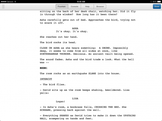
The Fountain preview is not perfect. I noticed parentheticals didn’t find the right margins and other bits of minor weirdness. But this workflow demonstrates one of the big advantages of Fountain’s plain-text heritage: you can adapt existing tools to work with it.
Fountain-centric iPad apps are coming, but until then there are no shortage of great text editors for iOS, so it’s worth experimenting. Anything you write in Fountain can easily be transformed into a PDF by apps like Highland or Slugline.