I’ll be back at my usual gate and time (5:45 a.m. at Paramount’s Van Ness gate) on Thursday, but writers interested in multi-camera comedies might want to check out Warners Gate 2, for the next Teaching Thursday.
From the organizers:
Writers of various genres join us each Thursday, making themselves available to discuss story, structure and everything in between to aspirings. All you have to do is come out and pick up a sign.
For our second Teaching Thursday hilarity will ensue! It’s MULTI-CAMERA COMEDY DAY! Not sure how to write for geeks when you’re tragically hip? The cool kids from “The Big Bang Theory” have answers! Want to know how to get your own personal studio audience? Writers from “The War At Home” know! And remember: If it rains on our heads, it’s tragic. If it rains on yours, it’s comedy gold!
Thursday, January 31st
9 AM to Noon
Warner Bros Gate 2.
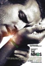 The [original one-sheet](http://johnaugust.com/archives/2007/the-one-sheet) for the movie featured Ryan Reynolds tying the green string around his wrist. Even as we were preparing for the theatrical release, we encountered resistance from Sony’s home video marketing folks, who worried that viewers might think the movie was in black-and-white. ((It’s tempting to mock corporate idiocy, but I strongly suspect their opinion comes from some hard data. For example: There are people who refuse to buy wide-screen editions of movies because those black bars aren’t using the full TV screen, and they want to get their money’s worth, dagnabit.)) Since I preferred this one-sheet to all other candidates, I told Sony that we could revisit the issue when it came time for the DVD. ((Also, one of my representatives gently reminded someone at Sony that I’d made a billion dollars for their company. That probably helped.))
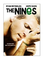 With these requirements, adaptations of the original one-sheet came back pretty unsatisfactory. In order to put the title on top, we had to go a little wider on the photo, which took a lot of the mystery out of it. The extra color softened it too much, and it certainly didn’t look like a thriller. If anything, it looked to be kin to that Hillary Swank/Gerard Butler movie about micro-managing from beyond the grave.
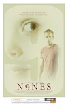 Punting, we looked at some of the other poster contenders. This one had been discussed and dismissed pretty early on, but the 9 background would certainly hold up to major shrinkage, and Ryan’s expression did say, “unsettling thriller.” Plus, there was plenty of room for blurbage. With considerable changes to color scheme and logotype, we ended up at the final DVD artwork.
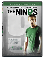 I don’t love it, but I accept it as a reasonable alternative given the constraints. Sony was actually really good to work with throughout the process, including me in decisions beyond the contractual obligations. Other than Big Fish, I haven’t been enthralled with any of the posters or key art for my movies, but I don’t know that it’s reasonable to expect a director — who spent two-plus years of his life making a film — to be content seeing it distilled down to one vertical rectangle.