In North America, The Nines is [now available on DVD](http://www.amazon.com/gp/redirect.html?ie=UTF8&location=http%3A%2F%2Fwww.amazon.com%2FNines-Ryan-Reynolds%2Fdp%2FB000YW8RN6%3Fie%3DUTF8%26s%3Ddvd%26qid%3D1198301424%26sr%3D8-1&tag=johnaugustcom-20). So I thought I’d explain what’s on the disc and why, and the process behind it.
The cover art
—-
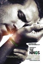
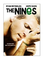
 The [original one-sheet](http://johnaugust.com/archives/2007/the-one-sheet) for the movie featured Ryan Reynolds tying the green string around his wrist. Even as we were preparing for the theatrical release, we encountered resistance from Sony’s home video marketing folks, who worried that viewers might think the movie was in black-and-white. ((It’s tempting to mock corporate idiocy, but I strongly suspect their opinion comes from some hard data. For example: There are people who refuse to buy wide-screen editions of movies because those black bars aren’t using the full TV screen, and they want to get their money’s worth, dagnabit.)) Since I preferred this one-sheet to all other candidates, I told Sony that we could revisit the issue when it came time for the DVD. ((Also, one of my representatives gently reminded someone at Sony that I’d made a billion dollars for their company. That probably helped.))
Once theatrical was finished, I was happy to have the conversation with the marketing folks. It kept coming back to the Wal-Mart factor: where would you physically put The Nines on the shelf? Is it in the thrillers, or the comedies, or the dramas?
A movie playing in a theatre can be several genres at once; a ticket buys you the experience of seeing the film, which you’ve presumably sought out based on advertising and publicity. But a DVD is a bunch of atoms that can only be in one place at a time. The box is either going to be in “thrillers” or “comedies.” And if you’re going to put it in thrillers, it needs to look like a thriller. If comedy, it has to look funny.
So while we’re not a typical thriller, that was the closest available category. The string-tying poster didn’t really work as that, and there were other problems:
* For DVDs, the title needs to be near the top. Think about seeing the box on the shelf, or flipping through them in a collection.
* You want space for blurbs and pull-quotes.
* You want the image to make sense at very small sizes, such as Amazon’s “you might also like” section.
* You can’t have a black-and-white (or nearly b&w) photo. That was an absolute from Sony, so more color would have to be added back.
 With these requirements, adaptations of the original one-sheet came back pretty unsatisfactory. In order to put the title on top, we had to go a little wider on the photo, which took a lot of the mystery out of it. The extra color softened it too much, and it certainly didn’t look like a thriller. If anything, it looked to be kin to that Hillary Swank/Gerard Butler movie about micro-managing from beyond the grave.
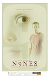
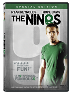
 Punting, we looked at some of the other poster contenders. This one had been discussed and dismissed pretty early on, but the 9 background would certainly hold up to major shrinkage, and Ryan’s expression did say, “unsettling thriller.” Plus, there was plenty of room for blurbage. With considerable changes to color scheme and logotype, we ended up at the final DVD artwork.
 I don’t love it, but I accept it as a reasonable alternative given the constraints. Sony was actually really good to work with throughout the process, including me in decisions beyond the contractual obligations. Other than Big Fish, I haven’t been enthralled with any of the posters or key art for my movies, but I don’t know that it’s reasonable to expect a director — who spent two-plus years of his life making a film — to be content seeing it distilled down to one vertical rectangle.
What’s inside
—-
While there were a lot of challenges and restrictions about what could be on the box, there was a lot more latitude about what could be inside. Sony hired a company called Blue Collar to produce the DVD menus, features and bonus content. There was a fixed budget, but beyond having to include a block of Sony trailers, we were free to do pretty much anything.
I’d already been working with Blue Collar before selling the movie at Sundance — Doc Crotzer from the company had been editing our behind-the-scenes footage for months — so by the time I met with Mark Rowen, Sarah Elbert and Erin Brett, they knew the movie inside-out. They were determined to make a disc that invited re-watching.
The movie itself is 99 minutes, which left a reasonable amount of space. But there was a lot I wanted to cram in.
Ryan Reynolds and I had already recorded one [commentary for the theatrical run](http://johnaugust.com/archives/2007/the-nines-audio-commentary), but I wanted a second one with Melissa McCarthy and editor Doug Crise. I wanted to include the short film God that Melissa and I made in 1998. I wanted storyboards. Script. Deleted scenes. A version of the floating words animation that was on the original [Look For The Nines](http://lookforthenines.com) site.
We also had a ton of behind-the-scenes footage. We had video running throughout production, so the challenge was cutting it into a shape that actually told a story, and wasn’t a self-congratulatory wank.
Plus I wanted Easter Eggs. Including more koalas.
Surprisingly, we got it all in. One of the features I’m happiest about is the script-storyboard-screen feature, which simultaneously shows the opening sequence through every stage.
The disc is labelled “Special Edition,” but make no mistake, it’s on the only edition. Six months or six years from now, there won’t be a director’s cut, or an extended edition, or a version that’s almost exactly identical except for one maddening change. There could conceivably be a Blu-ray version, but there’s nothing planned. So don’t wait for it.
I’m including a link to [Amazon](http://www.amazon.com/gp/redirect.html?ie=UTF8&location=http%3A%2F%2Fwww.amazon.com%2FNines-Ryan-Reynolds%2Fdp%2FB000YW8RN6%3Fie%3DUTF8%26s%3Ddvd%26qid%3D1198301424%26sr%3D8-1&tag=johnaugustcom-20), but of course it’s available in retail stores and rental shops just about everywhere in the U.S., and also on [Netflix](http://www.netflix.com/Movie/The_Nines/70066350?trkid=189530&strkid=535044068_0_0). If you have questions on the DVD (versus the movie itself), the comment section on this post is good place to ask.