Tin Fish
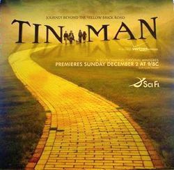
I knew that the Tin Man poster looked familiar.


This site is run by screenwriter John August. Mostly, he answers reader-submitted questions about the craft, but occasionally he goes on tangents that run far afield of writing and filmmaking. You'll also find info on past, present and future projects.
On Twitter: @johnaugust
If you have a question about screenwriting or my movies that hasn't been answered, by all means ask. There are a few guidelines to follow.
There are more than 900 articles on the site. You can find category archives at the bottom of every page.

A new short story available for download, Kindle and iPhone.
November 28th, 2007 at 10:36 am
but it’s obvious: there is no tree in the left one!
and the title doesn’t start with the same letter!
November 28th, 2007 at 10:54 am
Ouch, that’s pretty embarrassing. The Big Fish poster looks a lot better too. The composition of the Tin Man poster is pretty bad and the shadows aren’t even consistent, hehe.
November 28th, 2007 at 12:40 pm
i dunno. How many ways can you do a yellow brick road?
November 28th, 2007 at 12:58 pm
Yeah, I think that’s a tenuous link there. The movie is a low budget re-telling of OZ so how else could you do the poster without including those images.
EJ
November 28th, 2007 at 1:07 pm
It wasnt that long ago that you were ranting at someone who thought they may have been copied…
http://johnaugust.com/archives/2007/she-was-mistaken
Well, guess what? The wizard of oz has been around a lot longer than Big Fish, as have winding roads and sunsets
November 28th, 2007 at 1:24 pm
Haha! Gotcha!
November 28th, 2007 at 1:52 pm
Who’s ranting? The Tin Man poster reminds me a lot of the Big Fish poster, for reasons that are pretty evident to anyone with eyeballs. I didn’t create the Big Fish poster, though I like it. I also like the Tin Man poster, with the asterisk that I can’t shake the feeling that the former influenced the latter, perhaps a bit too transparently. If I were the designer of the Tin Man artwork, I might think twice before including it in my portfolio, because many potential art directors would immediately associate it with Big Fish.
EJ (#4):
The original campaign for Tin Man was very different:
link
And here’s the book cover:
link
November 28th, 2007 at 3:46 pm
Hey John – On another note, I can’t help but wonder if it bothers you that Big Fish is billed as coming “from the imagination of Tim Burton” while your and Wallace are just sort of tacked on at the bottom. Having read both the novel and your screenplay it seems the imaginations of both you and Wallace played a far bigger role. Industry politics and marketing realities aside…. does it bug you at all?
November 28th, 2007 at 6:42 pm
Rick, I have to agree with you. I always saw Big Fish as more of a John August film than a Tim Burton film-but that was because it didn’t seem like the classic Burton film. It lacked that gothic atmosphere. But it was very quirky. And the posters are very similar-except for that big tree. It’s like a before and after picture after a tree was planted (or cut down, your preference)
November 29th, 2007 at 12:03 am
Does anybody know more posters that show same ideas? Here’s my choice… the man in the background of “The Guilty” starring Bill Pullman and the poster of “Dark Blue” starring Kurt Russell.
November 29th, 2007 at 12:46 am
Well, Sarah, if you remember in 2002 the TV show Birds of Prey (your most likely do not-it was cancelled in a NY minute) the poster is the long lost twin of the poster for Underworld. BoP (http://www.impawards.com/tv/posters/birdsofprey.jpg) Underworld (http://www.idwpublishing.com/titles/images/underworld3.jpg)
Yeah, I can’t figure out how you link that stuff, Sarah, sorry, I’m not the most talented computist.
November 29th, 2007 at 1:33 am
KLM you must use HTML… it is explained on this webpage. Sorry, I just used the wrong linke. The Dark Blue poster is here
November 29th, 2007 at 2:11 am
Here’s another one… Gone With The Wind and The Empire Strikes Back (Han & Leia)
November 29th, 2007 at 9:28 am
the winding road and the sunset are not the main similarities. the text and the tiny silhouetted characters are. mostly that the text exists in the world of the image with the characters instead of being superimposed like on most posters.
November 29th, 2007 at 9:34 am
When you get a chance check out the cover of The Smithereens 11 CD and the poster for the Clooney/Pitt version of Ocean’s 11…(too lazy to post links)
November 29th, 2007 at 9:42 am
Entertainment Weekly has an occasional sidebar item that runs very similar movie posters. Most notably the ones for The Life and Death of Peter Sellers and Everything is Illuminated. Illuminated was released about a year after Sellers. See them side by side here.
November 29th, 2007 at 11:33 am
I knew it. I see that billboard for Tin Man every day when I drive through LA. And something about it was fishy… no pun intended.
November 29th, 2007 at 2:40 pm
No way, the yellow brick road totally veers in the other direction!
November 30th, 2007 at 12:00 pm
From #5: “It wasnt that long ago that you were ranting at someone who thought they may have been copied…”
Sick burn! Might as well have said, “You’re ugly and can’t read good.” Could have been just as relevant.
From #8: “Industry politics and marketing realities aside… does it bug you at all?”
Well, John, does it bug you?
December 1st, 2007 at 7:00 pm
From #8 and #19: “Industry politics and marketing realities aside… does it bug you at all?�
Well, John, does it bug you?
And I’m pretty sure your’s is not the only case where this happens… I want to know what you think about that, too… ;)
December 2nd, 2007 at 10:44 pm
@Carlos
No, but it’s a funny “Search & Find”-game :lol:
December 6th, 2007 at 12:41 am
I can imagine coming up with the Tin Man art without having ever seen the Big Fish art. Though not likely. Journey, road. Character on it, duh. Light centered far and away, on far and away character(s), while foreground is darker, it’s gonna be a happy ending.
The “Rudy” poster is similar, only on a field. “Band of Brothers” kind of too, no road, though. But, yeah, they’re different. I just peered through a couple hundred movie posters from different eras and I’m more wrong in my original assessment than I was right. I’m prepared to agree the Big Fish art directly influenced the Tin Man art.