• Skip to primary navigation
  • Skip to main content
  • Skip to primary sidebar

John August

  • Arlo Finch
  • Scriptnotes
  • Library
  • Store
  • About

Search Results for: courier

Introducing Courier Prime

January 28, 2013 Apps, News

Today, we’re introducing a new typeface designed for screenwriters. It’s called Courier Prime.

It’s Courier, just better:
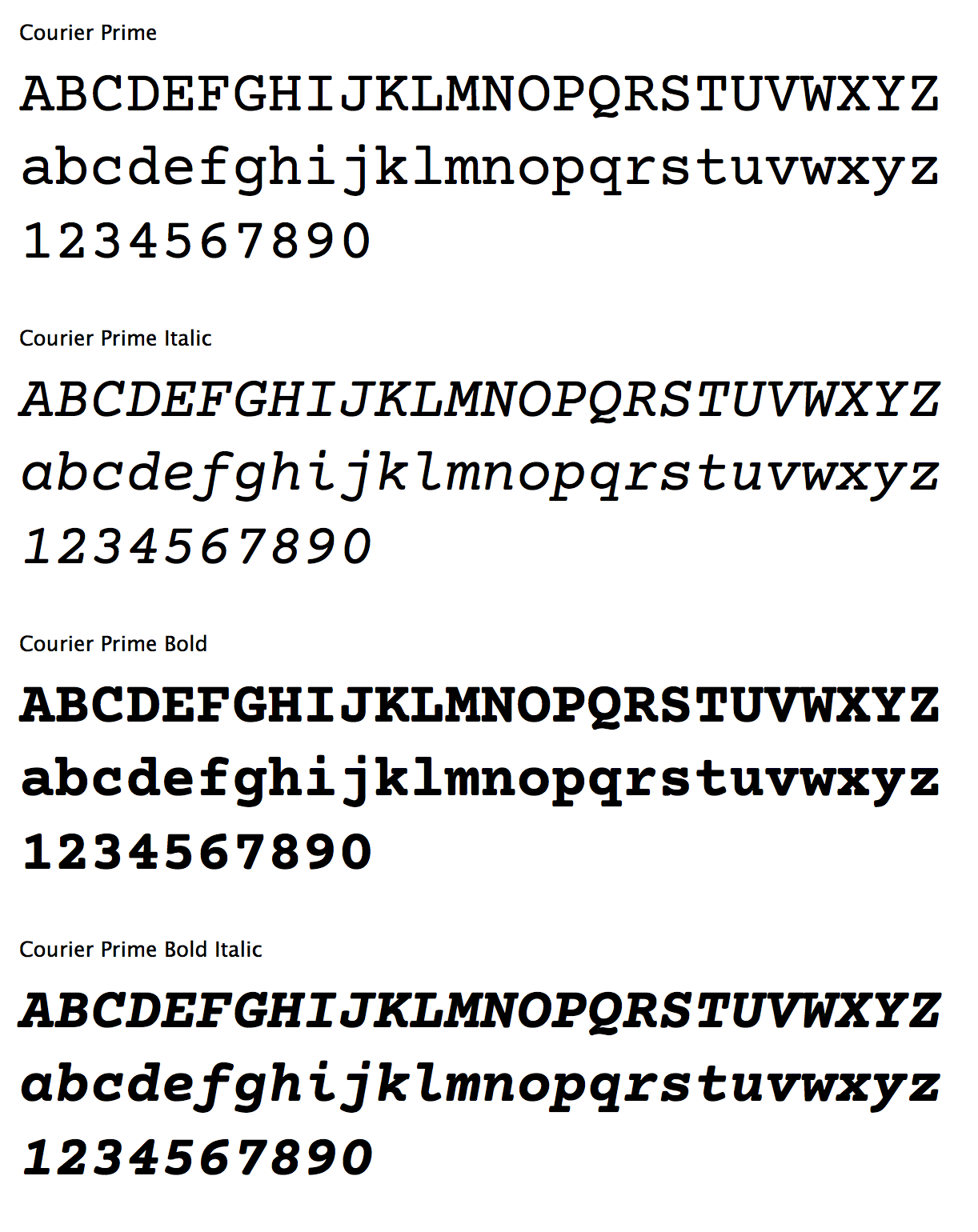
courier chart

It’s free, and available at Quote-Unquote Apps.

How we got here

Novels were once written by hand. So were plays and poems and speeches. As readers, we don’t see the original scrawl because they’ve been typeset along the way, transformed into something easier to read.

Screenwriting began in the era of typewriters, and it’s always been served raw. What the screenwriter pulls out of the typewriter isn’t a manuscript to be sent to the publisher — it’s the final product.

Over the years, the tools have changed, with the advent of computers and printers and PDFs. But we still expect scripts to look like they came out of a typewriter.

Specifically, we want screenplays to be twelve-point Courier.

The Courier typeface was designed in 1955 by Howard “Bud” Kettler for IBM. It’s classified as a monospaced slab serif, with each character taking up the same space and constructed with even stroke widths. IBM deliberately chose not to seek any copyright, trademark, or design patent protection on Courier, which is why it’s royalty free. It was the standard typeface on IBM’s best-selling Selectric II typewriter, and soon became the default typeface in Hollywood.

By standardizing around one typeface set at a specific size, we can take advantage of some rules-of-thumb.

For example, one page of screenplay (roughly, sometimes) equals one minute of screen time. More importantly, producers can be assured that a 119-page draft really is shorter than a 140-page draft. Unlike college freshmen, screenwriters can’t fiddle with the font to change the page count.

The biggest problem with Courier is that it often reveals its low-res heritage. Designed for an era of steel hitting ribbon, Courier can look blobby, particularly at higher resolutions.

But it doesn’t have to.

It’s Courier, just better.

In July 2012, I asked type designer Alan Dague-Greene to come up with a new typeface that matched the metrics of Courier — thus protecting line breaks and page counts — while addressing some of its weak spots.

I wanted a font that could be substituted letter-for-letter with Courier Final Draft, but look better, both on-screen and printed. I wanted a bolder bold and real italics, not just slanted glyphs.

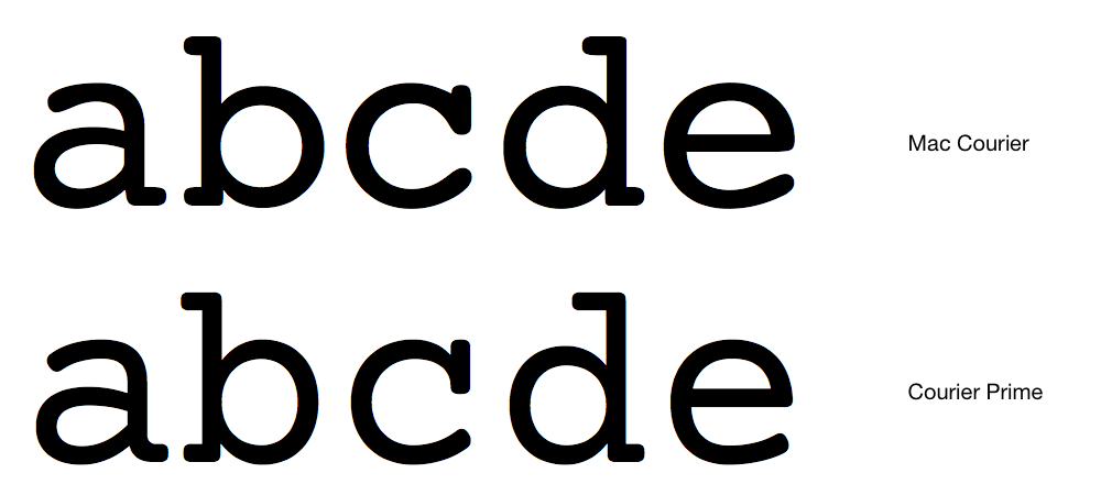
Alan rose to the challenge, creating a typeface that is unmistakably Courier, but subtly improved in ways you wouldn’t necessarily notice at first. Here’s a primer.
abcde comparison

The serifs are crisper and less rounded. They’re also less blobby where the serif connects — particularly in the lower-case c.

Look at the spaces inside the b and d. They’ve been opened up slightly, and the surrounding stroke tapered.

Still, you might occasionally wonder if you’re looking at regular Courier or Courier Prime. The quickest giveaway is the lowercase y, which loses its “foot” in Courier Prime.

y comparison

We ultimately went through 25 builds for Courier Prime.

With each new version, I’d prepare three sample screenplay pages — the same text but in three different fonts (standard Mac Courier, Courier Final Draft, and Courier Prime). The samples were given codenames (e.g. Fish, Dog, Bird) then shown to Actual Screenwriters, who voted on their favorite, not knowing which was which.

The early results were Not Good.

Screenwriters consistently preferred standard Mac Courier to our custom face. But we soon realized why: the standard Mac Courier is fairly heavy. Screenplays have a lot of white space, which makes thin Couriers look even thinner. As we gradually nudged up the stroke weight, we found the Goldilocks spot which was just right.

I want to thank all the screenwriters who participated in both the voting and the beta tests, and of course Alan Dague-Greene and Ryan Nelson for all their work getting the typeface out the door.

Courier Prime is available today, free, for Mac and Windows. It’s released under a very liberal license so developers can use it for iOS and Android apps. We hope screenwriters get a lot of use out of it.

How I Learned to Stop Worrying and Love Courier

February 10, 2005 Formatting, Geek Alert

[Geek Alert]I originally posted this as a reply in a screenwriting forum, but it’s pretty relevant here.

When I bought my first LaserWriter printer (probably 1993), I freaked out because Courier was suddenly ghastly thin. On my old StyleWriter inkjet, it had looked properly typewriter-like, but coming out of the laser printer, it was a shadow of its former self.

It bothered me enough that I used Fontographer to pull the Type 1 Courier outlines from the printer, then chunk-ify them a bit and save them as a Type 3 font, which I called Dorphic. (I have no idea why I picked that name, but it seemed to fit.)

So for many years, I happily used Dorphic on all my scripts. GO, for example, was in Dorphic. I would probably still be using that face, but the shift to OS X made Type 3 fonts impossible. I scoured the net for new options, and settled on Courier Ragged, which I used for a year or two.

But a new problem came up. Up until about 2003, when I needed to turn in a script to a producer or studio executive, I would print it out and call for a messenger. I could be certain the script would look right, because I was printing it myself. But once executives (and their assistants) became more internet-savvy, it made a lot more sense to turn in scripts in .pdf form. So, while I could use Courier Ragged, there was no guarantee it would look right when they printed it out.

All of which leads me back full-circle to plain old Courier. Of the natural alternatives (Courier New, or Courier Final Draft), it’s the best-looking to me, both on-screen and printed.

A side-note: Before I became a screenwriter, I made a meager living in graphic design. So the cruelest irony is that I’ve now spent a decade using nothing but 12-pt Courier, or its imitators.

Courier 12 pt. font

September 10, 2003 Formatting, QandA

Recently, I’ve begun buying published screenplays, and many of them seem to be written in Times or Times New Roman. Furthermore, the action in those scripts is italicized. Is that just for publishing purposes, or are scripts better written in Times (New Roman)? This is just something that’s been bugging me.

–Zach

"Real" scripts are still written in Courier, for no better reason than that’s how it’s always been. Publishers sometimes change the typeface to Times in order to make it more readable by the mass audience, but I honestly think it’s worse, particularly when action is italicized. (Italics are a holdover from published plays, where this is the norm. But plays have a lot less scene direction than movies.)

Several companies have recently started publishing screenplays that directly reproduce the original formating (one is Wheelhouse Books). If you have the choice, always pick the Courier version. It’s more like the original script, and it will hopefully convince publishers to give up their reformatting.

The Free Stuff

August 11, 2022 Apps, Bronson, Highland, Meta, News, Software, Tools, Weekend Read, Writer Emergency Pack

My friend Nima recently pointed out that most of the stuff our company makes is free.

That’s probably not a great business model, but it’s always been our culture. We only charge for those things that have significant ongoing costs — like upkeep and hosting — or a per-unit cost to produce.

If you’re a writer, here are the things we offer at absolutely no cost. As in free.

johnaugust.com

This blog has been running since 2003. Nearly all of its 1,500 posts are screenwriting advice. The Explore tab on the right is a good way to get started looking through the archives. For example, you might start with the 129 articles on formatting.

Scriptnotes

Craig Mazin and I have been recording this weekly screenwriting podcast for over ten years. It’s always been free, with no ads whatsoever. The most recent 20 episodes are available in every podcast player. Back episodes are available to Scriptnotes Premium members, or can be purchased in 50-episode “seasons.”

Inneresting

Chris Csont edits this weekly newsletter, which serves as a good companion to Scriptnotes. Every Friday, it has links to things about writing, centering on a given theme. It’s a Substack, but completely free.

Highland 2

For years, I’ve written all my scripts and novels in this terrific app our company makes. It’s a free download on the Mac App Store. The Standard edition is fully functional, with no time limits. Students can receive the enhanced Pro edition through our student license program.

Courier Prime

English-language screenplays are written in Courier, but not all Couriers are alike. Many are too thin, and the italics are ugly. So we commissioned a new typeface called Courier Prime. It’s Courier, but better. Since it’s free and open licensed, you can use it through Google Fonts and similar services.

Weekend Read

Reading a screenplay on an iPhone is a pain in the ass — unless you use Weekend Read. It melts down screenplay PDFs so they format properly on smaller screens. Weekend Read also has an extensive library of older scripts, including many award nominees. It’s free on the App Store.

The Library

The Library has most of the scripts I’ve written, and hosts a few other writers’ work as well. For several projects, I’ve included treatments, pitches, outlines and additional material.

Screenwriting.io

While johnaugust.com offers detailed articles on various topics, screenwriting.io answers really basic questions about film and TV writing. If you’re Googling, “how many acts does a TV show have?” we want to give you the answer with no cruft or bullshit.

100 Most Frequently Asked Questions about Screenwriting

We gathered the 100 most frequently searched-for entries on screenwriting.io in this handy 85-page PDF.

Launch

I recorded this seven-episode podcast series about the pitch, sale, writing and production of my first Arlo Finch book. If you’ve ever thought about writing a book, you’ll want to check it out. Free wherever you listen to podcasts.

The Paid Stuff

Given all the free stuff we put out, how does our company make money? We sell things.

Highland 2 Pro

Highland 2 Standard Edition is free, but most users choose to upgrade to Pro for its added features: revision mode, priority email support, extra templates, custom themes, and watermark-free PDFs. It’s an in-app purchase, $39 USD.1

Writer Emergency Pack

Writer Emergency Pack began its life as a Kickstarter, and is now one of the most popular gifts for writers of all ages. Available through our store and Amazon.

Bronson Watermarker PDF

Bronson is the app I needed when watermarking scripts for a Broadway reading. Now it’s become the default watermarking app in Hollywood. It’s $20 on the Mac App Store.

T-shirts and hoodies

We used to print and ship our own t-shirts, but we now sell them through Cotton Bureau. We put out a new Scriptnotes shirt every year. It’s definitely not a profit center, but it’s fun seeing merch out in the wild.

Weekend Read Unlocked

Users can unlock their expanded library for $10 USD.

Scriptnotes Premium

The Scriptnotes podcast runs out of a separate LLC from our software business. Premium subscriptions pay for the salaries of our producer, editor and transcriptionist, along with hosting and management fees. Craig and I don’t make a cent off it.

  1. Prices may change. Also note that Apple sets international pricing, so some apps cost a little more or a little less in some countries. ↩
Next Page »

Primary Sidebar

Newsletter

Inneresting Logo A Quote-Unquote Newsletter about Writing
Read Now

Explore

Projects

  • Aladdin (1)
  • Arlo Finch (27)
  • Big Fish (87)
  • Charlie (39)
  • Charlie's Angels (16)
  • Chosen (2)
  • Corpse Bride (9)
  • Dead Projects (18)
  • Frankenweenie (10)
  • Go (30)
  • Karateka (4)
  • Monsterpocalypse (3)
  • One Hit Kill (6)
  • Ops (6)
  • Preacher (2)
  • Prince of Persia (13)
  • Shazam (6)
  • Snake People (6)
  • Tarzan (5)
  • The Nines (118)
  • The Remnants (12)
  • The Variant (22)

Apps

  • Bronson (14)
  • FDX Reader (11)
  • Fountain (32)
  • Highland (72)
  • Less IMDb (4)
  • Weekend Read (34)

Recommended Reading

  • First Person (87)
  • Geek Alert (147)
  • WGA (123)
  • Workspace (19)

Screenwriting Q&A

  • Adaptation (66)
  • Directors (90)
  • Education (49)
  • Film Industry (486)
  • Formatting (129)
  • Genres (90)
  • Glossary (6)
  • Pitches (29)
  • Producers (59)
  • Psych 101 (117)
  • Rights and Copyright (96)
  • So-Called Experts (47)
  • Story and Plot (170)
  • Television (164)
  • Treatments (21)
  • Words on the page (238)
  • Writing Process (178)

More screenwriting Q&A at screenwriting.io

© 2023 John August — All Rights Reserved.