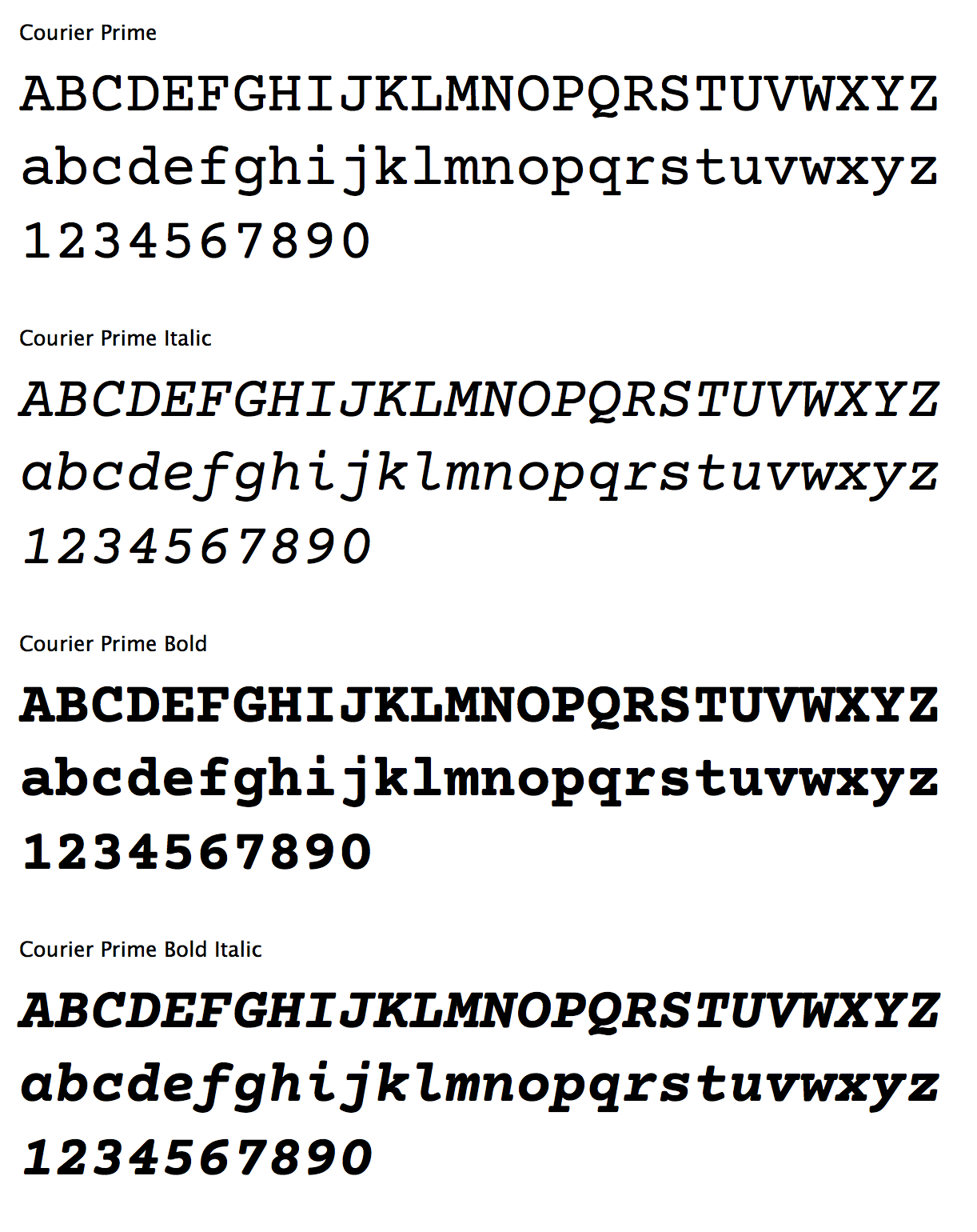
Today, we’re introducing a new typeface designed for screenwriters. It’s called Courier Prime.
It’s Courier, just better:
It’s free, and available at [Quote-Unquote Apps](http://quoteunquoteapps.com/courierprime/).
How we got here
—-
Novels were once written by hand. So were plays and poems and speeches. As readers, we don’t see the original scrawl because they’ve been typeset along the way, transformed into something easier to read.
Screenwriting began in the era of typewriters, and it’s always been served raw. What the screenwriter pulls out of the typewriter isn’t a manuscript to be sent to the publisher — it’s the final product.
Over the years, the tools have changed, with the advent of computers and printers and PDFs. But we still expect scripts to look like they came out of a typewriter.
Specifically, we want screenplays to be twelve-point Courier.
The Courier typeface was designed in 1955 by Howard “Bud” Kettler for IBM. It’s classified as a monospaced slab serif, with each character taking up the same space and constructed with even stroke widths. IBM deliberately chose not to seek any copyright, trademark, or design patent protection on Courier, which is why it’s royalty free. It was the standard typeface on IBM’s best-selling Selectric II typewriter, and soon became the default typeface in Hollywood.
By standardizing around one typeface set at a specific size, we can take advantage of some rules-of-thumb.
For example, one page of screenplay (roughly, sometimes) equals one minute of screen time. More importantly, producers can be assured that a 119-page draft really is shorter than a 140-page draft. Unlike college freshmen, screenwriters can’t fiddle with the font to change the page count.
The biggest problem with Courier is that it often reveals its low-res heritage. Designed for an era of steel hitting ribbon, Courier can look blobby, particularly at higher resolutions.
But it doesn’t have to.
It’s Courier, just better.
—–
In July 2012, I asked type designer Alan Dague-Greene to come up with a new typeface that matched the metrics of Courier — thus protecting line breaks and page counts — while addressing some of its weak spots.
I wanted a font that could be substituted letter-for-letter with Courier Final Draft, but look better, both on-screen and printed. I wanted a bolder bold and real italics, not just slanted glyphs.
Alan rose to the challenge, creating a typeface that is unmistakably Courier, but subtly improved in ways you wouldn’t necessarily notice at first. Here’s a primer.
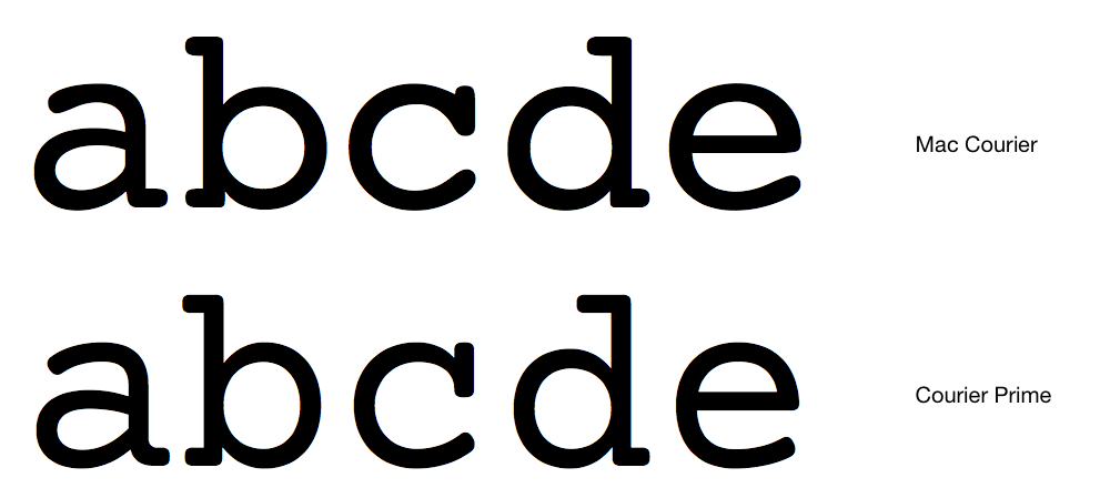
The serifs are crisper and less rounded. They’re also less blobby where the serif connects — particularly in the lower-case c.
Look at the spaces inside the b and d. They’ve been opened up slightly, and the surrounding stroke tapered.
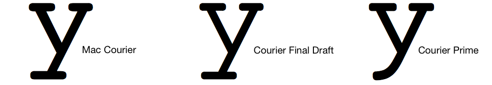
Still, you might occasionally wonder if you’re looking at regular Courier or Courier Prime. The quickest giveaway is the lowercase y, which loses its “foot” in Courier Prime.
We ultimately went through 25 builds for Courier Prime.
With each new version, I’d prepare three sample screenplay pages — the same text but in three different fonts (standard Mac Courier, Courier Final Draft, and Courier Prime). The samples were given codenames (e.g. Fish, Dog, Bird) then shown to Actual Screenwriters, who voted on their favorite, not knowing which was which.
The early results were Not Good.
Screenwriters consistently preferred standard Mac Courier to our custom face. But we soon realized why: the standard Mac Courier is fairly heavy. Screenplays have a lot of white space, which makes thin Couriers look even thinner. As we gradually nudged up the stroke weight, we found the Goldilocks spot which was just right.
I want to thank all the screenwriters who participated in both the voting and the beta tests, and of course Alan Dague-Greene and Ryan Nelson for all their work getting the typeface out the door.
Courier Prime is [available today](http://quoteunquoteapps.com/courierprime/), free, for Mac and Windows. It’s released under a very liberal license so developers can use it for iOS and Android apps. We hope screenwriters get a lot of use out of it.