Reader Jason writes:
> [My boss] was giving our poor assistant the grueling duty of digitizing boxes and boxes of her old scripts. In the mire, he came across something we all found amusing -– coverage you did back in 1992.
He attaches coverage I wrote for both Quentin Tarantino’s NATURAL BORN KILLERS and Sam Hamm’s PULITZER PRIZE.
I don’t publish reviews of unproduced screenplays (ahem), but I’ll happy share what I wrote about [Tarantino’s NBK](http://johnaugust.com/Assets/nbk.pdf).
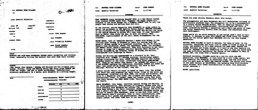
I read it (and wrote this coverage) during my first semester of film school at USC. I probably read 200 scripts that year, but I remember this one distinctly, because upon reaching the last word I promptly flipped back to page one and read it again.
(This was Fall 1992. Little did I know that the following year I’d be working for the movie’s producers during post-production, and would co-write the novelization.)
Next to James Cameron’s ALIENS scriptment, NBK was probably the single screenplay that most made me want to become a screenwriter.
So why the hell did I give it “good” across the board rather than “excellent?”
An acute case of chickenshititis, I suspect. We were strongly discouraged from ever using the “excellent” boxes. Just writing “consider” was a bold move. I’ll cut my younger self a break just this once.
Some extra details about this document, just because I remember:
* I’m pretty sure I wrote this for a class assignment, rather than my reader internship. Laura Ziskin taught our first development class. Each week, we checked out two scripts from her extensive script library. ((The idea of “checking out” something seems quaint, but photocopying was fairly expensive.))
* I wrote this on the Mac, most likely in [ClarisWorks](http://en.wikipedia.org/wiki/AppleWorks). For the cover page, we had a pre-printed template to use. Most readers used a typewriter to do the cover sheets, but with enough finessing, I got the fields in ClarisWorks to line up properly.
* This coverage was probably printed on a StyleWriter. Sometime later that year I bought a LaserWriter — an expensive indulgence at the time, but much cheaper through the USC Bookstore. The LaserWriter had a thin and terrible version of Courier, so I used Fontographer to make a chunkier one I called Dorphic, which I continued to use for many years. (Go is printed in Dorphic.)
In my essay on [Professional Writing and the Rise of the Amateur](http://johnaugust.com/archives/2006/professional-writing-and-the-rise-of-the-amateur), I make a pointed challenge:
> So you have to ask yourself: a year from now, five years from now, how am I going to feel when someone asks me about that thing I wrote?
This coverage is eighteen years old, from the pre-internet era. Further proof you don’t get to choose when to be professional.
You can read the full coverage [here](http://johnaugust.com/Assets/nbk.pdf).