Arlo Finch in the Valley of Fire came out in February 2018 in the US and Canada, but the international editions are only now debuting. And in many cases, the book you see in stores overseas looks very different.
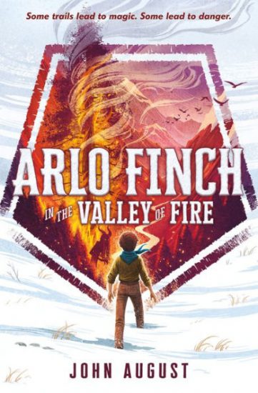
Here’s the book in the US, with a cover by Vivienne To.
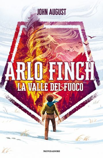
Italian publisher Mondadori is the first to offer a translated version — it came out this month. They’re using the same basic artwork for La Valle del Fuoco.
So far, Italy is the exception. In most markets, publishers are creating their own artwork for the cover.
German publisher Arena went with a more comic-book style, illustrated by Helge Vogt. It comes out in August.
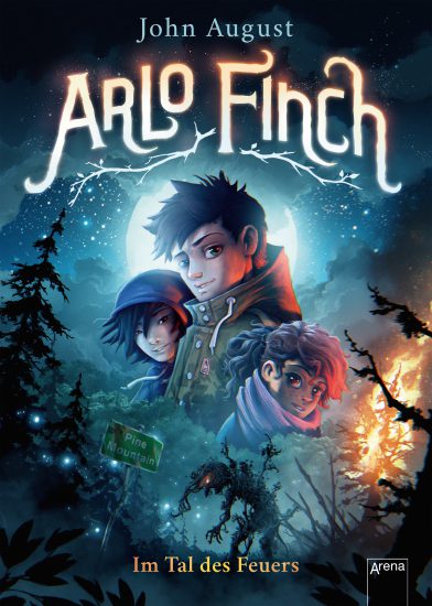
The German version also has interior illustrations — the only one so far. Translation is by Andrea and Wieland Freund.
French publisher Milan hired Levente Szabó for their edition, which comes out in September. They’ve stuck with Adam Ladd’s Cheddar Gothic as the typeface, however.
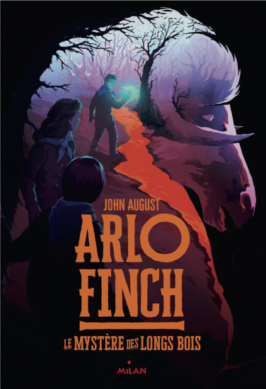
In France, instead of Valley of Fire, this book is subtitled The Mystery of the Long Woods. It’s very common for French publishers to rename books; the first Harry Potter is The School of Sorcerers in France.
The French translation is by Leslie Damant-Jeandel. It’s terrific. I got a chance to look through it when doing press in Paris earlier this summer.
The Swedish and Norwegian editions also come out in September. Here they’ve gone for more of a Stranger Things vibe.
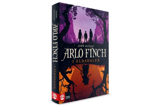
The artist is Håkan Liljemärker. The Swedish translation is by Mats Kempe, while the Norwegian is by Tore Aurstad.
The Dutch cover for Arlo Finch: De Vuurvallei is the only one with photographic elements. As I’m posting this, the artwork isn’t finalized, and I haven’t learned details about the translator. It’s scheduled to come out in October. ((I’ll be headed to Germany, Norway, Sweden and Denmark in October for launch events. More details soon.))
In addition to these countries, Arlo Finch is also scheduled to be released in translation for Denmark, Poland, Brazil, Romania and Israel. No word yet on what those covers will look like.
Why aren’t international covers the same as the US?
As a screenwriter, I’m used to seeing some variation in movie posters and video covers. Not only do studios mock up and test various versions of one sheets, ((“One sheet” is the standard term for movie posters in the US. Classically, they’re printed in reverse on the back side so that when inserted into a lighted display case at a movie theater, the color is vibrant.)) they sometimes make different choices for US and overseas markets.
In the case of Big Fish, Sony Pictures tried a completely different approach in Japan.


But for the most part, the one sheet for a given movie is going to look very similar in most countries. That’s because in the age of worldwide marketing, it’s generally the same studio releasing the film in every territory, often on the same date.
That’s not true for books. In most cases, publishers are only buying rights to the book for a single country or language, and the book will come out months after the English debut.
For Arlo Finch, Macmillan is my publisher for the US and Canada, but I have 11 different publishers for other languages. When these publishers bought the book, they only bought the text, not the cover — that’s owned by Macmillan.
Which means international publishers have a choice:
- Negotiate to license the cover from Macmillan.
- Make their own cover.
Publishers generally choose the second option. It gives them the chance to make their own creative choices about how to market and position the book for their market.
French publisher Milan might have a theory that French girls are less likely to pick up a book without a girl on the cover. German publisher Arena may have data showing that German kids want books to look like comics even when they’re not. ((I’m making these examples up.))
While rates can vary wildly, cover artists are not that expensive. So it makes sense for publishers to hire their own.
As an author, do you get much say in book covers? Generally, no. You may have some contractual approval, but it’s more akin to giving one’s blessing than actual feedback. They don’t want you to hate the cover, but short of that, they’re fine trusting their instincts. ((Movies are largely the same in terms of approvals. Filmmakers will be shown a range of possibilities, but the real decisions are made by the marketing team.))
Which is the “real” Arlo Finch cover?
Six months ago, I would have said that the US cover is the real cover. It’s still the only one I’ve seen printed on a book jacket.
But now I’m not so sure. I love the French and Scandinavian covers, especially how they seem to push the age up a bit. I’m intrigued by the German cover, even if it’s not my taste.
In the end, book covers serve two purposes. The first is as bait. Does the design convince you to pick up the book? My hunch is that all of these international covers do the trick.
The second function of a cover design is to help frame the reading experience. That’s what I’m most curious about with some of these covers. By showing Arlo’s friends, does it suggest the story will be an ensemble adventure? Does emphasizing the Hag on the German and Scandinavian covers signal too strongly what’s going to happen in the book?
We’ll see. I’m excited to start getting reactions from folks reading Arlo Finch in a language other than English.
Meanwhile, I’ve just gotten my advanced copies of the second book in the series, Arlo Finch in the Lake of the Moon.
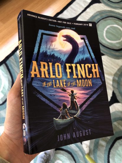
Each international publisher will soon need to figure out how they want to handle the cover this time. Do they feature the lake, the monster, the patrol, or another set piece in the book? There’s no one right answer, and just like with Valley of Fire, there won’t be one definitive cover. But this one’s going to be hard to top.