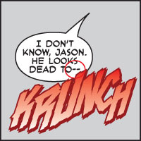
Comic book grammar
Nate Piekos has a great piece at Blambot explaining the grammar and tradition of comic book lettering. It’s worth a look for any screenwriter considering writing for the paneled medium.
Comic book lettering has some grammatical and aesthetic traditions that are quite unique. What follows is a list that every letterer eventually commits to his/her own mental reference file. The majority of these points are established tradition, sprinkled with modern trends and a bit of my own opinion having lettered professionally for a few years now. The majority of these ideas have been established by Marvel and DC, but opinions vary from editor to editor, even within the same company.
Many of the examples, such as when to use ellipses verus dashes, have parallels in modern screenwriting. But as a former font nerd, I was surprised I never noticed the rule about crossbar I, or the existence of breath marks. They were always there, but when used properly, completely disappear.
(Thanks to Daring Fireball for the link.)


February 2nd, 2009 at 3:46 pm
Hey John:
First, thanks for the amazing site. I’ve been a regular reader for years, and you’ve helped my work in many, many ways.
Quick question prompted by reading the excellent comic book grammar lexicon. I know you decided to defer formatting questions to the Hollywood Standard (my copy is now dog-eared), but here’s a point on which that fine book and the (agency- and studio-supplied) scripts that I read often differ.
The double dash. Do you use it? With spaces on either side? Of course, there’s no em- or en-dash in true courier, but I see SO MANY scripts that only use one hyphen where a double dash is what (I think) is needed.
I thought the Blambot distinction between using a double-dash or ellipsis was very helpful.
The double dash was drilled into me in college, but I see it missing in many scripts.
Thoughts?
Thanks!
February 2nd, 2009 at 3:54 pm
I do use the double dash, with spaces on either side. In Courier, that’s really what looks best.
If you look through my scripts in the Library, you’ll see that I’m not especially consistent about when I use dashes instead of ellipses. “Abruptness” is usually the test, but sometimes one just feels better than the other.
February 2nd, 2009 at 4:34 pm
Love the double dash. And thanks for pointing out the link as it is rather timely to my current efforts to come up with unique onomatopoeia for a comic book I’m creating.
February 2nd, 2009 at 5:33 pm
Ah, Comics, my first love. I wanted to be a comic book artist; ironically I think more visually when I write.
February 2nd, 2009 at 5:43 pm
For real? We’re not using two spaces after the end of a sentence anymore?
February 2nd, 2009 at 5:48 pm
@Ditka:
Comic book lettering doesn’t use two spaces, nor does pretty much anything set in a proportional typeface. Stuff set in monospace fonts (like Courier) tends to use two spaces.
Screenplays (12-pt. Courier) still use two spaces after the period.
February 3rd, 2009 at 8:26 am
Just an interesting tidbit. The “!?” combination of punctuation is known as an “Interrobang” or “interabang”. (http://dictionary.reference.com/search?q=interabang)
You know where I learned this? The 90s version of the Mickey Mouse Club.
February 3rd, 2009 at 10:45 am
Somewhat related: Scott McCloud’s “Understanding Comics” is a great piece of literature, not just for comic book artists and writers, but for filmmakers as well. It’s a fascinating look at the relationship between art and its audience, and how an artist establishes links between the two– which is what that Blambot post is talking about.
February 9th, 2009 at 2:08 pm
Hey John, why don’t you take advantage of the opportunity to pimp up Kevin Spacey’s Triggerstreet.com? They have a great place for upcoming screenwriters there (and comic writers as well)!
Check it out, one of these days, if you haven’t yet.